PROJECT OVERVIEW
The Problem: Following a major merger, Aveanna Healthcare's digital presence was fragmented. The website failed to serve its three primary audiences: patients seeking care, clinicians seeking careers, and families seeking information. This resulted in user frustration, brand inconsistency, and inefficient lead generation.
The Solution: A complete redesign of the corporate website, engineered from the ground up on a user-centric foundation. The new platform provides distinct, intuitive pathways for each user group, unified under a cohesive brand identity and built on a scalable, modern tech stack.
My Role: Lead UX/UI Designer. I directed the project from initial research synthesis and strategy formulation through to information architecture, wireframing, high-fidelity visual design, and final design system handoff to the development team.
The Strategic Challenge
The core challenge was to resolve the tension between diverse user needs and singular business objectives.
User Pain Points:
Information Silos: Critical information for patients and job seekers was buried across disconnected sections of the site.
Navigational Confusion: Users lacked clear entry points and pathways relevant to their specific goals.
Cognitive Overload: Inconsistent branding and dense, clinical language created a barrier to understanding and trust.
Business Obstacles:
Brand Fragmentation: The digital experience did not reflect the unified strength of the newly merged Aveanna Healthcare.
Inefficient Lead Capture: The site lacked a clear conversion strategy, resulting in lost opportunities for both patient intake and talent acquisition.
High Friction, Low Engagement: Analytics revealed high bounce rates and low time-on-page, indicating a fundamental failure to meet user expectations.
Defining Success: Project Goals
The project was guided by specific, measurable objectives.
Simplify the User Experience: Design discrete, frictionless journeys for the three core user personas (Care Seeker, Career Seeker, Information Seeker).
Unify the Brand Identity: Create a consistent, trustworthy, and professional visual language that reflects Aveanna's market leadership.
Drive Quantifiable Growth: Increase qualified patient leads by 25% and boost career applications through the portal by 30%.
Enhance Performance: Reduce the overall site bounce rate by 40% and increase the average time on site.
My Design Process
A four-phase approach ensured that every design decision was rooted in data and strategic intent.
Discover ➔ Define ➔ Design ➔ Deliver
Phase 1: Discovery & Synthesis
This phase focused on deep immersion into the user and business context.
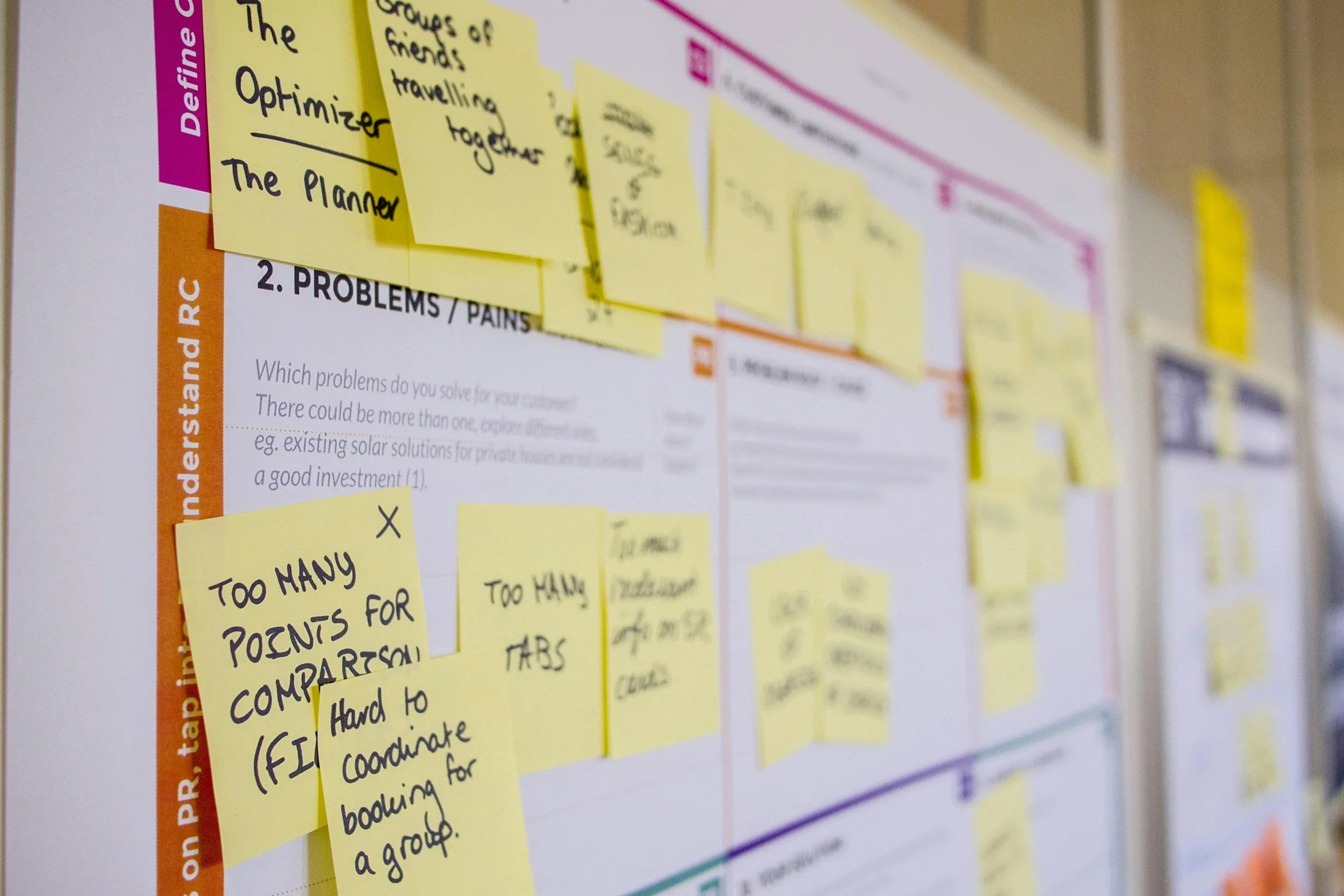
Stakeholder Alignment & User Interviews
We conducted interviews with internal stakeholders to map business goals and operational realities. This was paired with interviews of representative users, including families of patients and clinical job seekers, to uncover their primary motivations, frustrations, and decision-making criteria.
Key Insight: Users required distinct, frictionless paths for three core tasks: finding care, seeking a career, or locating a clinic. The old site forced all users through the same convoluted funnel.
Competitive Landscape Analysis
An analysis of direct competitors and best-in-class healthcare platforms revealed opportunities for differentiation. Top competitors had clear calls-to-action and segmented user entry points. Aveanna could win by combining this clarity with a more compassionate and human-centric design language.

Phase 2: Defining the Architecture
With a foundation of research, the next step was to structure the experience.
User Personas
Primary personas were synthesized from our research to serve as a constant reference point for the design team.

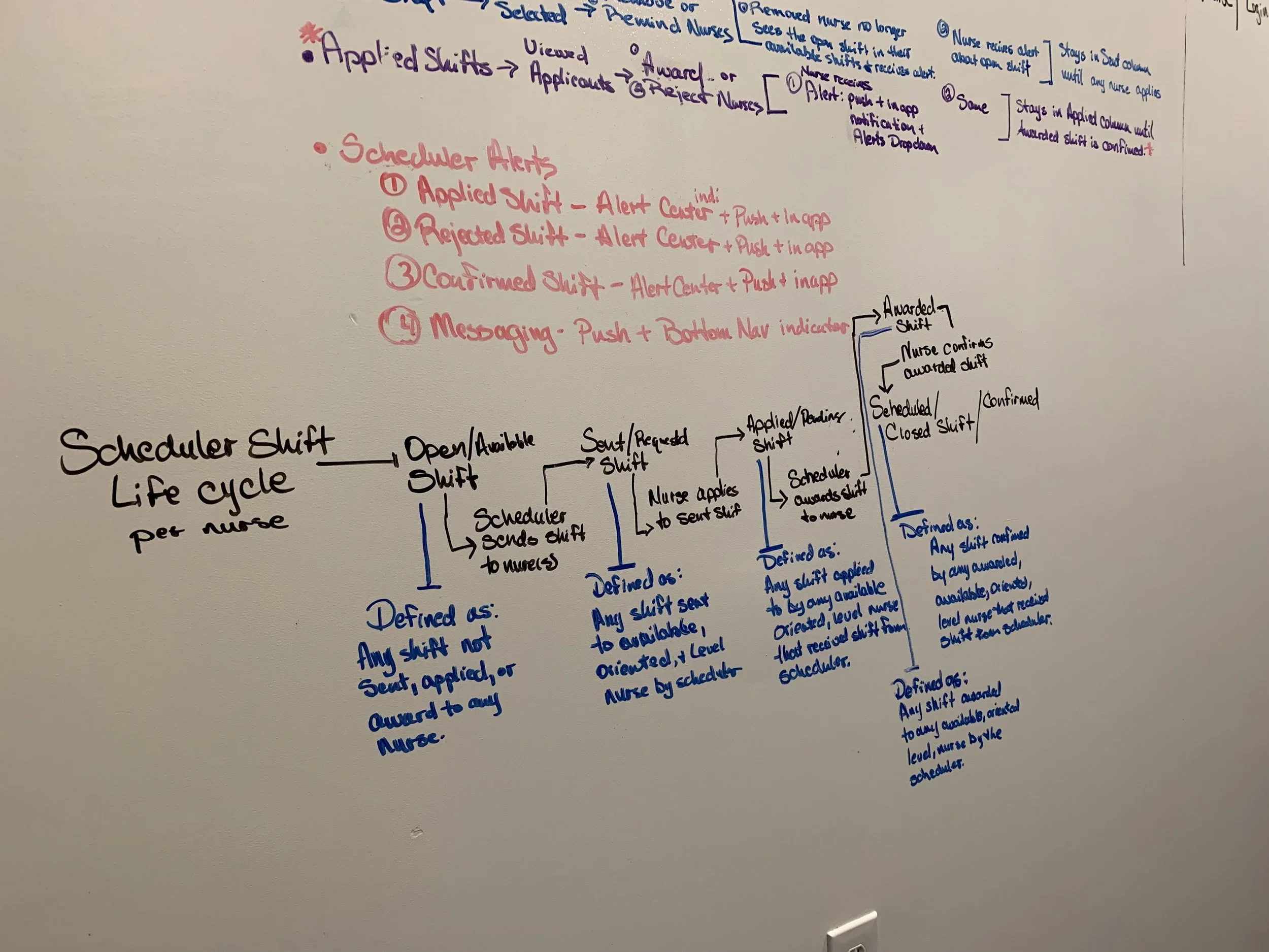
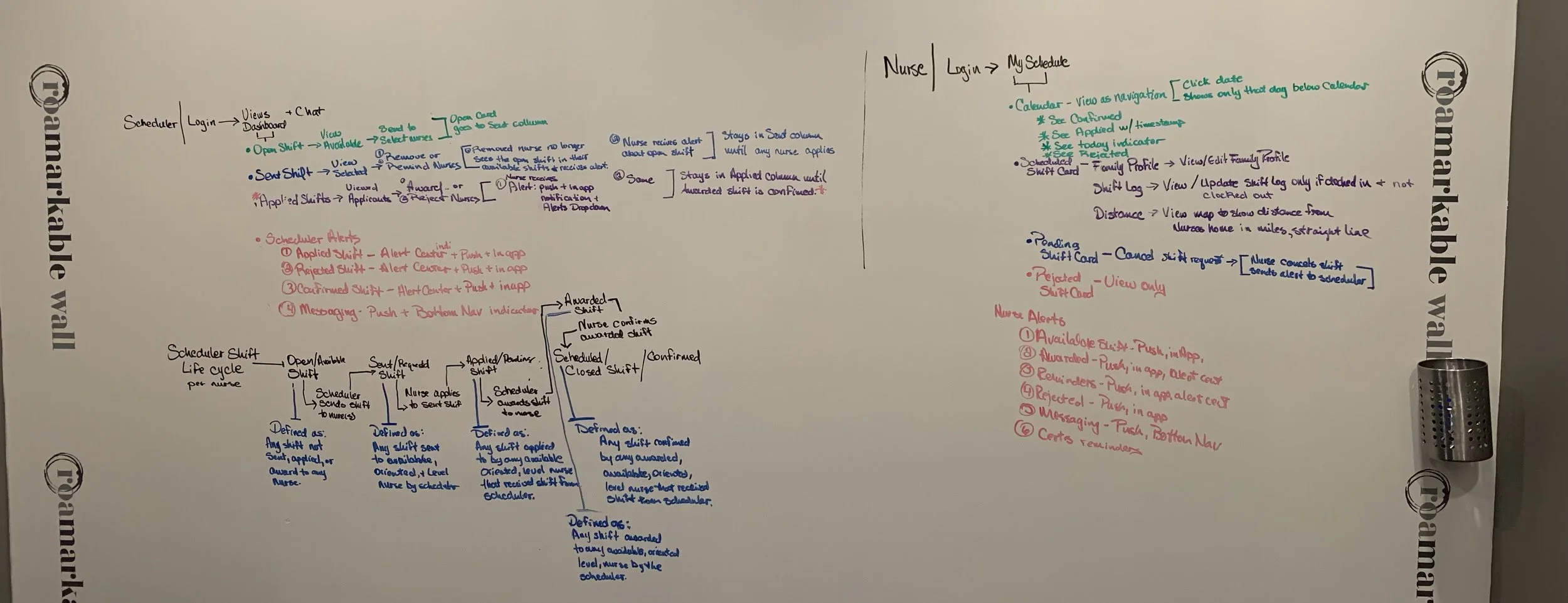
Information Architecture (IA)
Designed a clear and intuitive IA for both the mobile app and web portal, ensuring seamless navigation and easy access to critical information
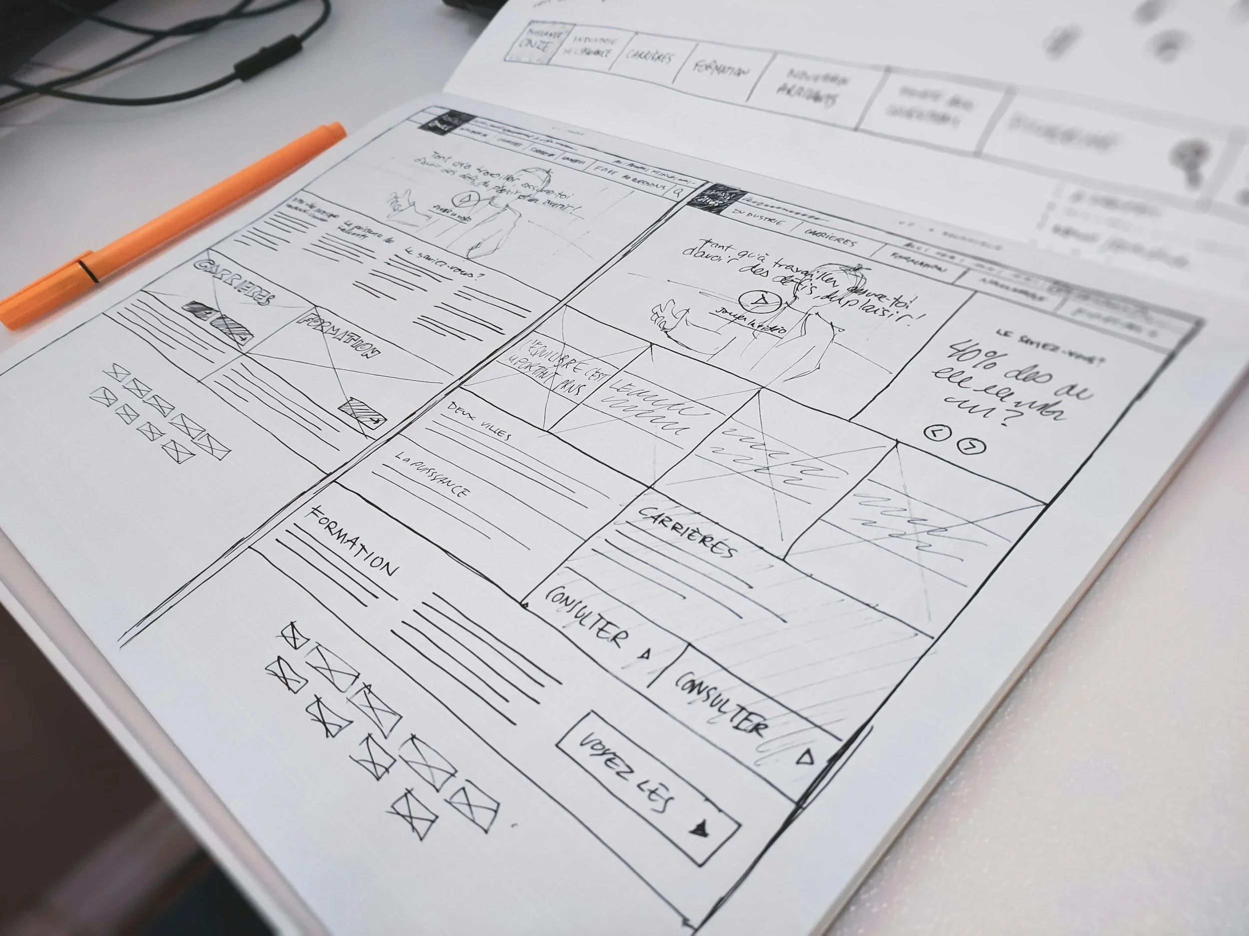
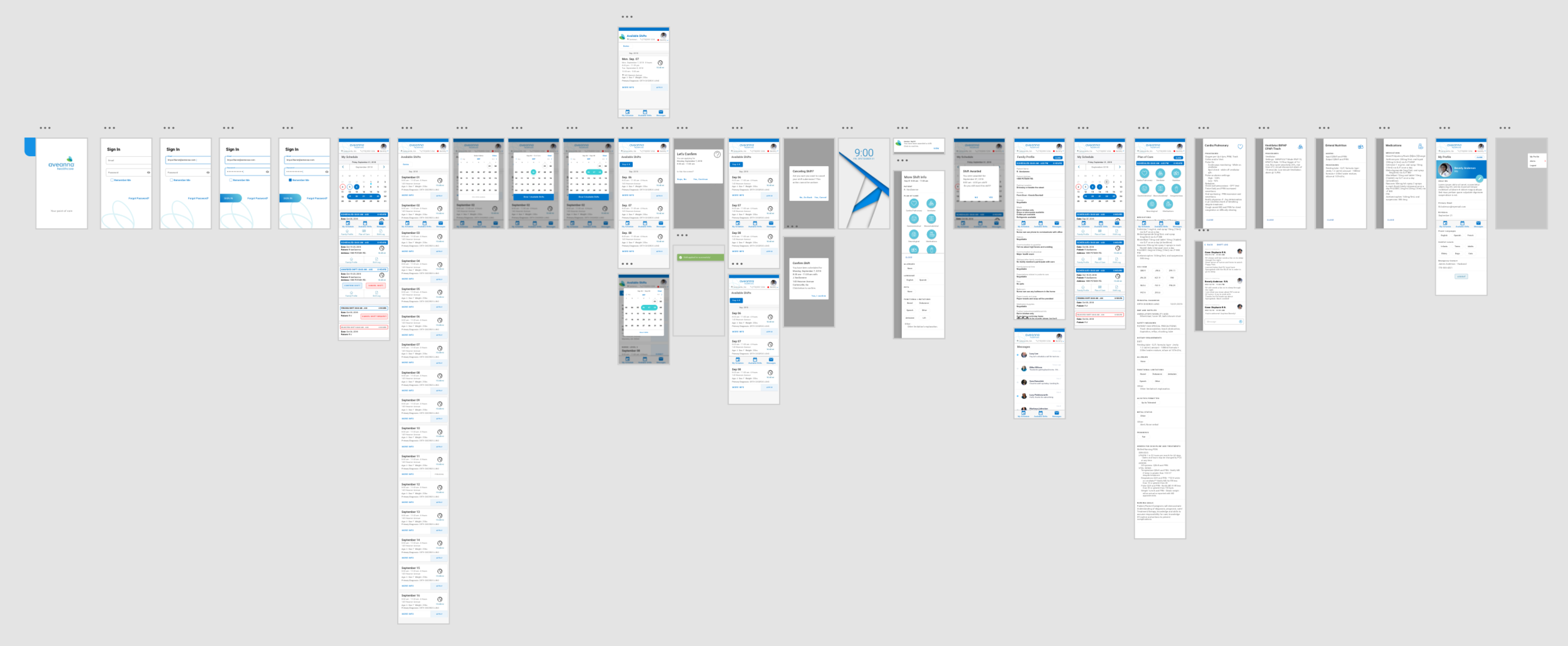
Wireframing:
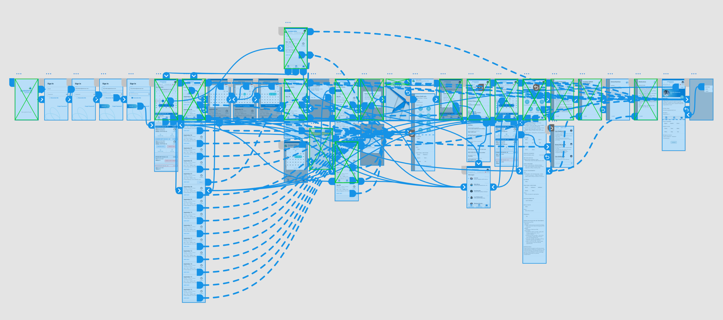
Created low-fidelity wireframes to map out the core functionality and user flows for key features.
Mockups:
Developed high-fidelity mockups to visualize the user interface, visual design, and interaction patterns
Usability Testing:
Conducted iterative usability testing with real users on interactive prototypes to identify and resolve usability issues.
KEY FEATURES & FUNCTIONALITY
Mobile App (for Caregivers)
Digital Timesheets: Simplified time tracking with GPS-based check-in/check-out.
Appointment Management: Clear view of upcoming appointments, patient details, and route optimization.
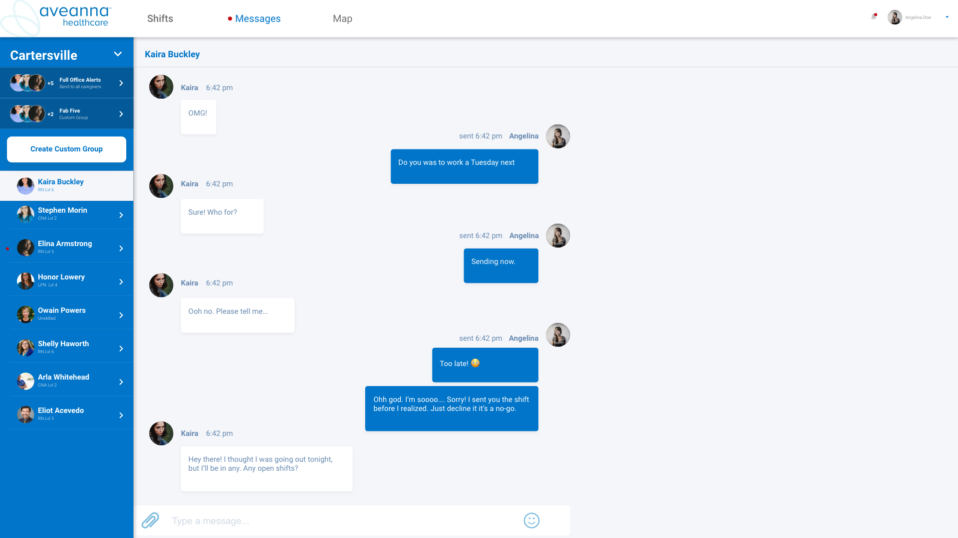
Secure Messaging: Direct communication with office staff and authorized family members.
Patient Information: Secure access to patient care plans, medications, allergies, and notes.
Task Management: Digital task lists with reminders and progress tracking.
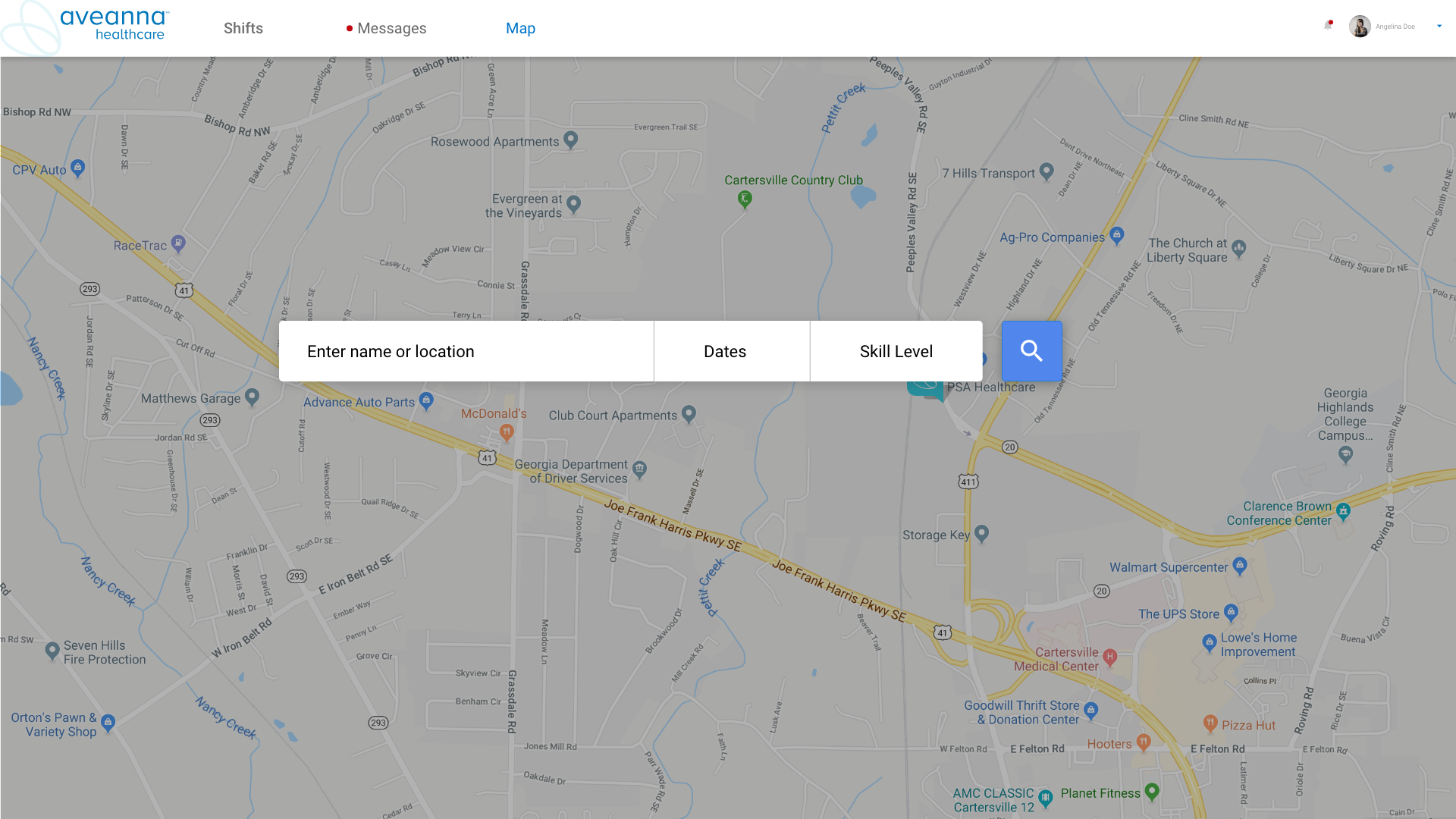

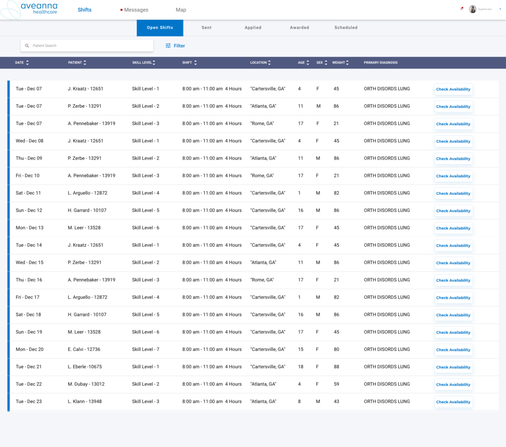
Web Portal (for Office Staff)
Centralized Scheduling: Real-time view of caregiver availability and patient needs.
Automated Scheduling Tools: Drag-and-drop scheduling, automated matching, and conflict detection.
Caregiver Management: Comprehensive caregiver profiles with skills and certifications.
Patient Management: Detailed patient records and care plans.
Reporting & Analytics: Generate reports on key performance indicators (KPIs).